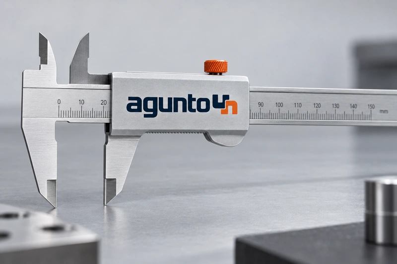
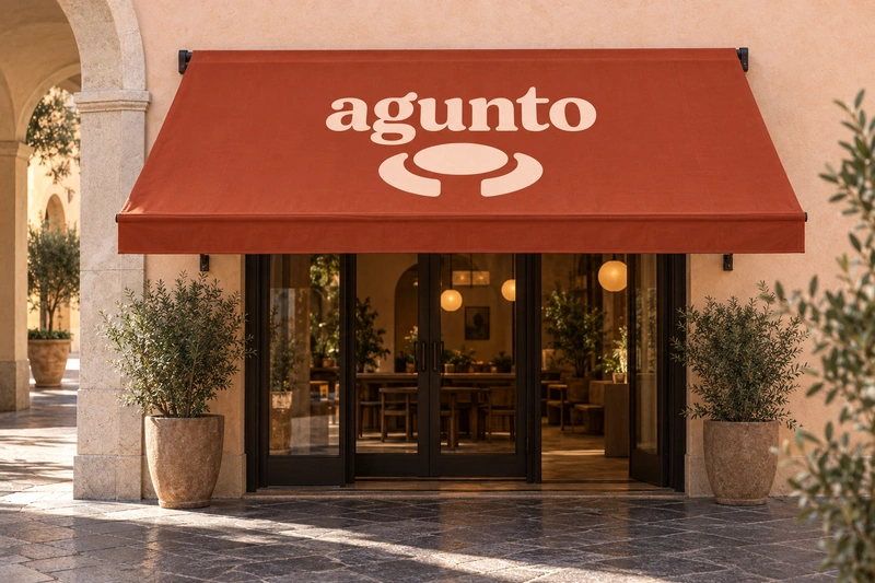
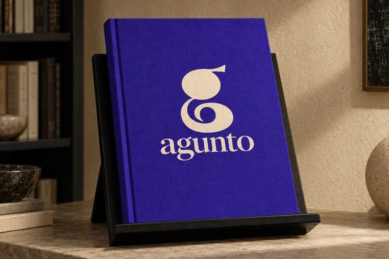
Agunto pairs a compact, grounded shape with a rounded finish. The result feels measured rather than formal, making it a plausible identity for a business that values useful design, considered choices, or a welcoming experience. Its adjacent u and n also offer a subtle visual relationship: similar forms facing in different directions.
For professional tools or technical services, the name could suggest a thoughtful approach to solving practical problems. In hospitality or shared spaces, it could take on a more sociable character. An independent publisher or curated design platform could instead emphasize judgment and authorship. These are positioning possibilities, not established meanings. Because Agunto does not announce a category, a clear descriptor and consistent verbal introduction would be important early parts of its use.
Name analysis
Agunto has six letters and a natural three-syllable reading. English speakers might say uh-GUN-toh, while ah-GOON-toh is another plausible interpretation. Both retain a hard g and a clear final syllable, but a brand should choose one form for consistent spoken use. In lowercase, the adjacent u and n provide a near-inverted visual pairing, while the g adds a distinct descending form in many typefaces. No verified etymology is supplied, and any resemblance to words in other languages should be treated as an association to investigate, not a definition.
Assessment summary
Agunto is a composed, approachable name with enough structural character to support a recognizable identity. It is particularly credible where thoughtful construction, human connection, or editorial judgment matters. Its main trade-off is the work required to establish a category and a consistent spoken form.